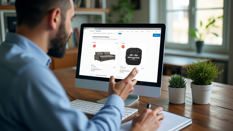
TL;DR: To stop losing sales, immediately optimize your product images for clarity, refine your copy to highlight benefits over features, and streamline the checkout process to reduce friction. These three critical adjustments will elevate your brand perception and significantly boost conversion rates.
1. Elevate Visual Quality and Presentation
Your product page is the digital storefront, and visuals are the first point of contact. If your images are blurry, poorly lit, or lack context, customers will assume your product is low quality. Start by ensuring every image is high-resolution. Use a clean, white background for the main product shot to maintain a professional, premium aesthetic. This allows the product to stand out without distraction. Next, provide multiple angles. Customers cannot touch the product, so they rely on visual cues to understand its shape, size, and texture. Include close-up shots that highlight material quality, stitching, or finish details. This transparency builds trust and reduces the likelihood of returns due to mismatched expectations. Furthermore, use lifestyle images to show the product in use. This helps customers visualize how the item fits into their lives, creating an emotional connection that drives purchasing decisions. Avoid using stock photos if possible; authentic, original imagery performs better and reinforces brand integrity. Ensure all images load quickly by optimizing file sizes without sacrificing quality. Slow loading times are a major cause of bounce rates, so use modern formats like WebP to maintain speed and clarity. Remember, consistency in style and lighting across all images creates a cohesive brand narrative that feels intentional and high-end.
2. Refine Copywriting for Benefit-Driven Persuasion
Once the visual hook is set, your copy must seal the deal. Many brands make the mistake of listing technical specifications exclusively. While data is important, customers buy solutions, not just features. Rewrite your product descriptions to focus on benefits. Instead of stating a jacket has “water-resistant fabric,” explain that it keeps you “dry and comfortable during sudden downpours.” Use clear, concise language that is easy to scan. Break up large blocks of text with bullet points that highlight key selling points. This improves readability and helps hesitant shoppers quickly find the information they need. Incorporate social proof directly into the description. Mentioning that a product is a “bestseller” or has “over five-star ratings” leverages the power of social validation. However, ensure your tone matches your brand identity. A luxury brand should use sophisticated, elegant language, while a playful brand might use humor and casual phrasing. Consistency in voice reinforces brand identity. Additionally, be transparent about limitations or care instructions. Honesty builds long-term trust. Avoid hyperbolic claims that cannot be substantiated, as this erodes credibility. Use active voice to create energy and urgency. For example, “Experience the difference” is more engaging than “The difference is experienced.” Finally, optimize your headlines. The main headline should clearly state what the product is and its primary benefit. Subheadings should guide the reader through the page, making the journey to purchase intuitive and frictionless.
3. Streamline the Call-to-Action and Trust Signals
The final barrier to sale is often friction in the purchasing process. Your Call-to-Action (CTA) button must be prominent, clear, and impossible to miss. Use a contrasting color that stands out against your background. The text should be action-oriented, such as “Add to Cart” or “Buy Now,” rather than vague terms like “Submit.” Place the CTA button above the fold, ensuring it is visible without scrolling. Additionally, reduce distractions by removing unnecessary navigation links during the checkout phase. Guide the user’s eye solely toward the purchase. Build trust by displaying secure payment badges, return policies, and customer service contact information near the CTA. This alleviates fears about security and post-purchase support. Consider offering a limited-time guarantee or free shipping threshold to incentivize immediate action. Keep the form fields to a minimum; ask only for essential information to complete the transaction. Every extra field increases the chance of abandonment. Test your checkout process on mobile devices to ensure it is seamless. A clunky mobile experience will cost you a significant portion of sales. By removing friction and building trust, you create a smooth path to purchase that converts browsers into buyers.
Leave a Reply